Northwestern Illinois Transit Tableau Dashboard
This dashboard is published online. Please click the button below to view the dashboard.
Project Title: Northwestern Illinois Transit Study
Tool Used: Tableau
Client/Organization: Urban Transportation Center (UTC), University of Illinois Chicago
Funding: Illinois Department of Transportation (IDOT)
Year: 2022–2023
Collaborators: Jin Jang, Cemal Ayvalik (UTC Staff)
Introduction
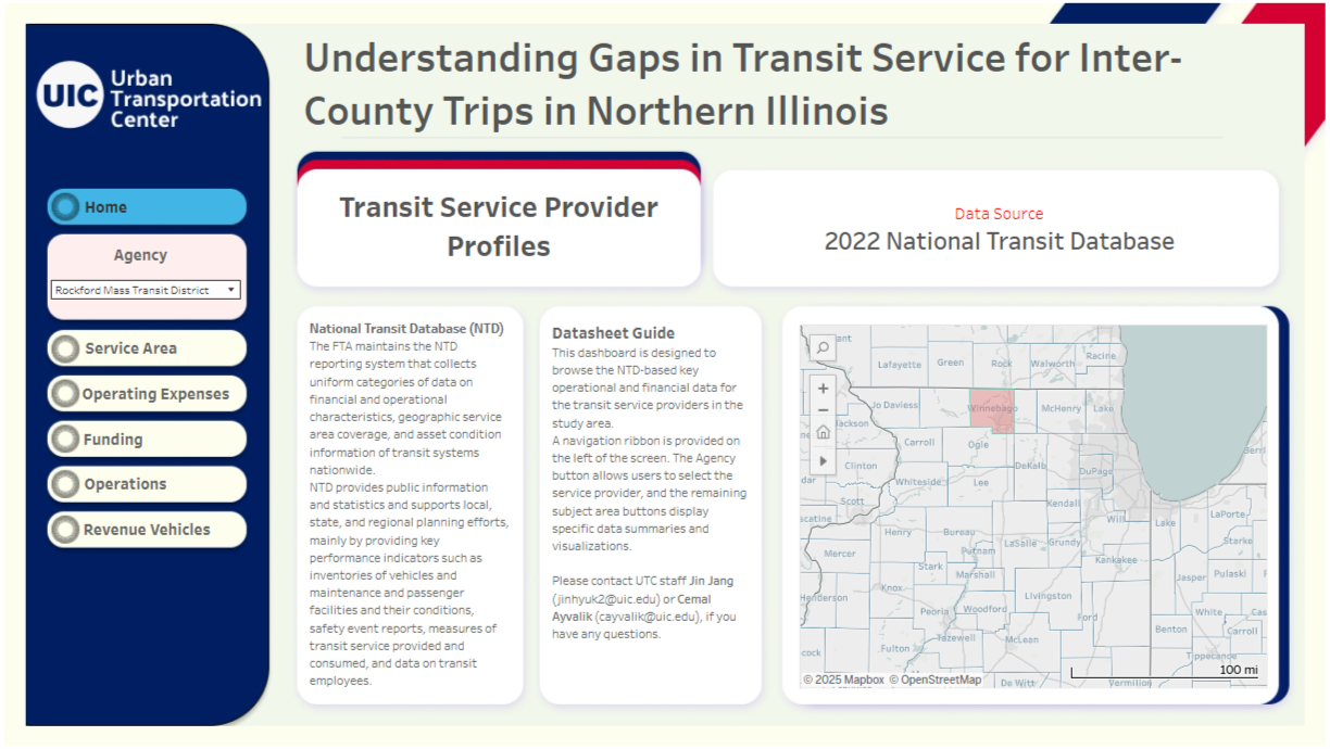
This interactive Tableau dashboard was developed as part of the Northwestern Illinois Transit Study, a research initiative funded by the Illinois Department of Transportation. The study’s goal was to provide a comprehensive assessment of public transportation performance across eight counties in Northwestern Illinois: Winnebago, Ogle, Lee, Carroll, Whiteside, Jo Daviess, Stephenson, and DeKalb.
The dashboard serves as a centralized tool to explore key performance indicators, financial data, service coverage, and fleet characteristics of transit agencies operating in the region. By transforming complex and dispersed data from the National Transit Database (NTD) and the American Community Survey (ACS) into an intuitive, user-friendly interface, this tool supports data-driven decisions for planners, researchers, and stakeholders.
Project Overview
The Northwestern Illinois Transit Study aims to assess public transit performance, identifying strengths, gaps, and opportunities for improvement in inter-county transit services.
The NTD provides standardized data on financial and operational characteristics, geographic coverage, and asset conditions, making it a robust foundation for regional analysis.
Dashboard Features and Insights The dashboard is organized into five sections, each providing targeted insights. The tool’s intuitive navigation ribbon allows users to filter by agency and explore specific metrics across five key sections.
1. Homepage:
The homepage introduces the project and features a navigation menu on the left, allowing users to select agencies and pages. It provides a high-level overview, setting the stage for deeper exploration.
2. Service Area:
This section presents demographic and geographic data of transit agencies. A chart on population trends from 2000 to 2020 reveals insights into long-term transit demand. For example, if the chart shows steady population growth, RMTD (Rockford Mass Transit Agency) may need to expand service capacity to meet future needs. Conversely, a plateauing trend could suggest focusing on efficiency or targeting underserved groups, such as households without vehicles, which the dashboard can quantify to align services with community needs.
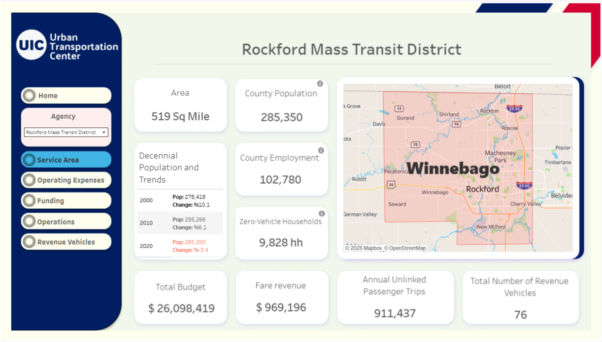
The population trend chart is critical for long-term planning. If projections indicate growth, agencies could prioritize fleet expansion or route optimization. If the data shows a high proportion of carless households, targeted demand-response services could address accessibility gaps.
3. Operating Expenses:
The Operating Expenses tab details operating costs, broken down into major categories such as vehicle operations, maintenance, and administration. The chart visualizes these categories, showing vehicle operations as the largest expense, consistent with industry norms. Subcategory breakdowns provide granularity, enabling stakeholders to identify cost drivers.
For instance, high maintenance costs could indicate an aging fleet, prompting investment in newer vehicles.
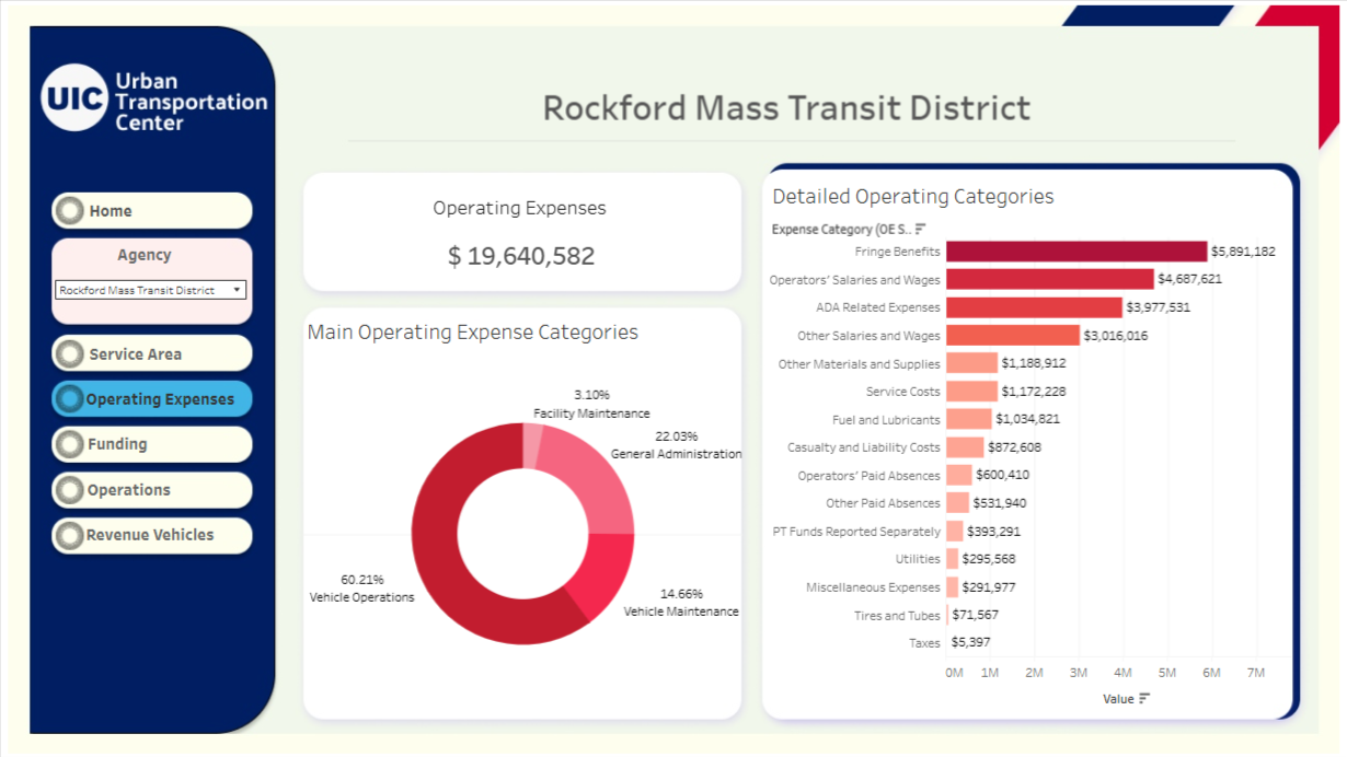
If vehicle operations dominate the budget (e.g., 60-70% of total costs), RMTD could explore fuel-efficient vehicles or optimized scheduling to reduce expenses. High administrative costs, if present, might suggest opportunities for streamlining operations.
4. Funding:
The Funding section highlights transit agencies total budget , with budget allocated to operations. Charts show funding trends over time, funding sources (e.g., federal, state, local), and the key metric of funding per passenger trip.
This metric offers insights into cost efficiency. For example, a high funding-per-trip ratio could indicate low ridership or high operational costs, signaling a need for service adjustments or fare optimization.
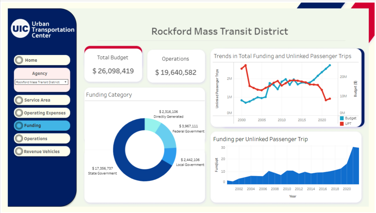
If federal or state funding constitutes a significant portion of the budget, agencies' financial sustainability may depend on securing consistent grants. A rising funding-per-trip ratio could prompt strategies to boost ridership, such as marketing or expanded service hours.
5. Operations:
This section visualizes service data, including miles served, trips taken, and service span by mode (e.g., motor bus, demand-response). The Service Span chart for this page and this transit agency, RMTD, shows motor bus services operating longer hours than demand-response, with visual cues for peak service times. For instance, if peak hours align with commuter schedules (e.g., 7-9 AM, 4-6 PM), RMTD is effectively serving workday commuters but may need to assess off-peak coverage for other trip purposes.
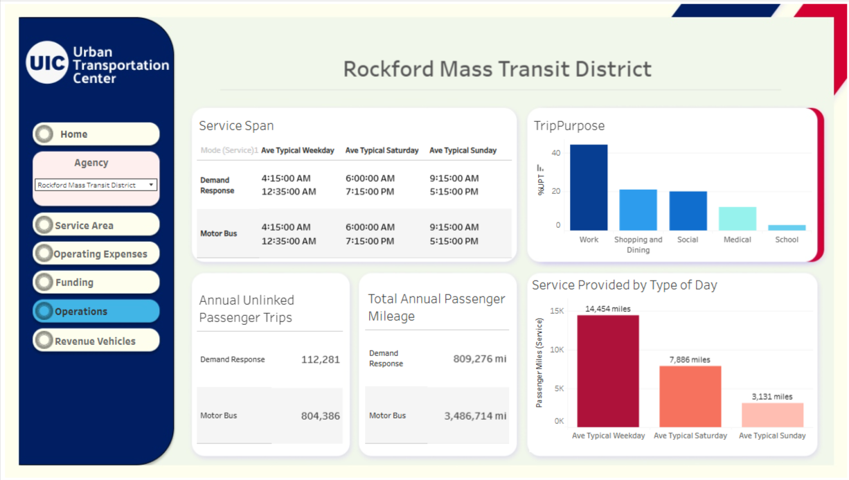
If demand-response services show shorter spans, RMTD could explore expanding these to serve non-traditional commuters, such as seniors or disabled riders. Low trip volumes in certain modes may indicate underutilized services, suggesting route or schedule adjustments.
6. Revenue Vehicles
The Revenue Vehicles page details agencies’ fleet vehicles. Charts show age distribution by vehicle type and fuel type, with some vehicles possibly exceeding their useful life benchmark. For comparison, the earlier example of Rockford Transit noted 23 diesel vehicles past their useful life. If RMTD’s chart shows similar aging trends, it signals a need for fleet modernization to maintain reliability and efficiency.
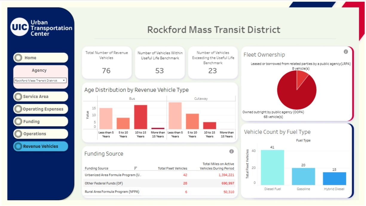
An aging fleet (e.g., vehicles over 10-12 years) increases maintenance costs and risks service disruptions. If most vehicles are diesel, transitioning to electric or hybrid models could reduce long-term costs and environmental impact, aligning with sustainability goals.
Technical Development
Building this dashboard involved overcoming two key challenges:
- Data Integration: The dataset combined 14 NTD tables of 10 transit agencies (e.g., engineering, operating expenses, revenue, fleet) with American Community Survey (ACS) demographic data. Each table had a unique structure, so I created a relational database, linking tables via NTD IDs and defining foreign keys for ACS data. This enabled seamless filtering and cross-referencing, ensuring users could explore interconnected metrics, like linking fleet age to maintenance costs.
- Comprehensive Visualization: To present diverse data cohesively, I organized the dashboard into five pages with interactive filters and visualizations. This structure balances accessibility with depth, allowing users to drill down into specific metrics without overwhelming the interface.
Hosted on Tableau Public, the dashboard consolidates over 15 NTD sources, making complex data accessible to stakeholders and the public.
Acknowledgments
This work was done as part of my role as a Data Scientist and Research Assistant at the Urban Transportation Center (UTC). I would like to thank Jin Jang and Cemal Ayvalik for their guidance and collaboration throughout the project.
Impact and Future Work
The dashboard provides a comprehensive view of North Western Transit Agencies' operations, revealing insights like potential fleet modernization needs or opportunities to optimize funding efficiency. Its interactive design empowers planners to address service gaps and supports transparent decision-making. For example, the high operating expenses and aging fleet highlighted in the charts suggest prioritizing capital investments in newer vehicles.
Explore More Visit the dashboard on my Tableau Public profile to explore project’s data interactively. For more of my data science and visualization work, check out my portfolio or connect with me on LinkedIn.
Thank you for exploring this project! This dashboard demonstrates my ability to transform complex transit data into actionable insights, driving smarter public transit planning in Northwestern Illinois.